No33 Cafe Redesign
2024
I evaluated the No33 Cafe website and identified several opportunities for improvement. These include enhancing navigation to make it easier for customers to explore the site, incorporating design elements that strengthen the brand identity, and implementing features that encourage visitors to engage with the cafe and ultimately visit in person.
Process
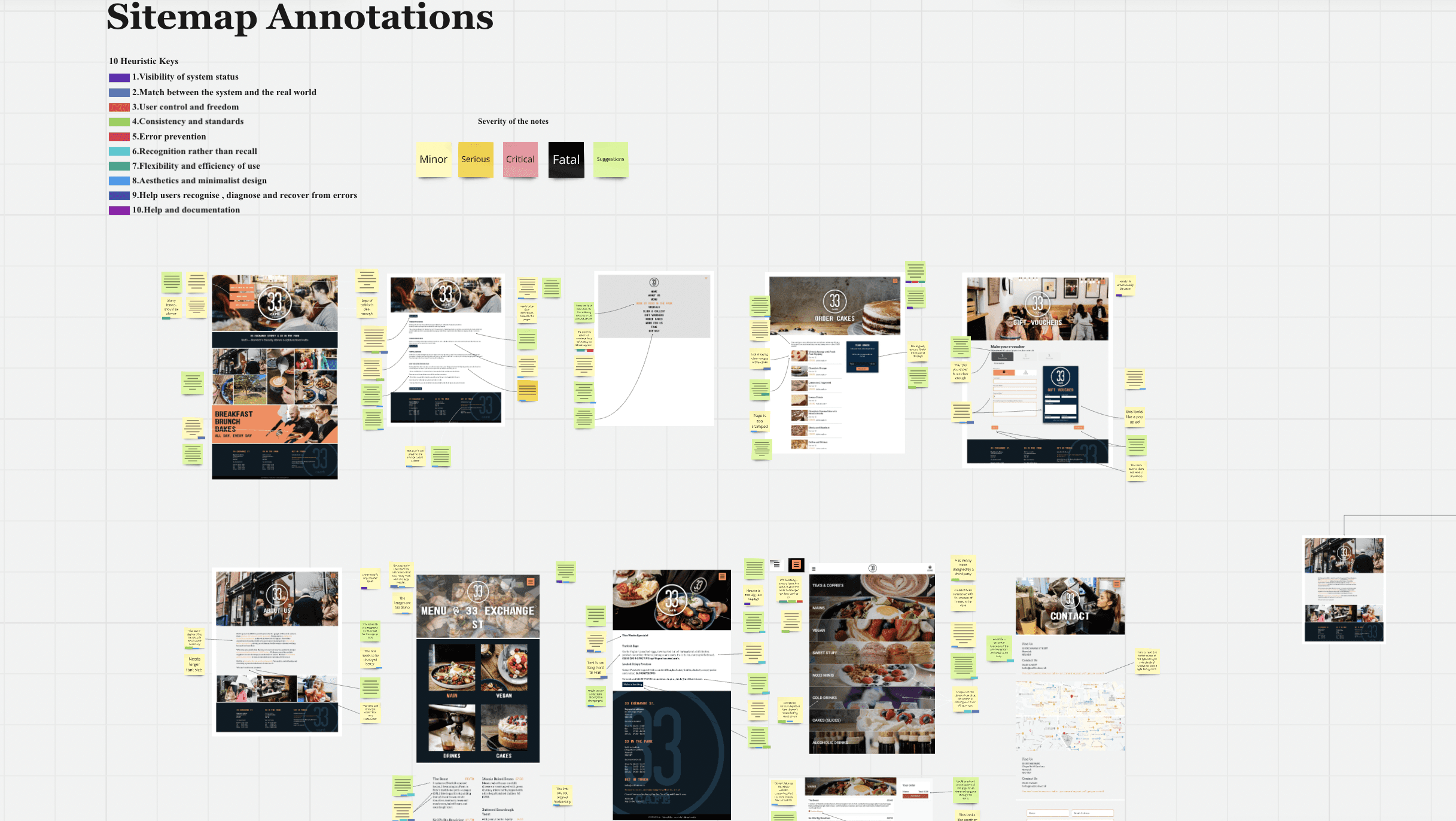
I began by analysing the website's sitemap to identify areas for improvement in terms of appearance, accessibility, and navigation, using the Nielsen Norman Group's 10 Usability Heuristics as a framework. During this process, I mapped out key user journeys, highlighting potential pain points or "red routes" where users might struggle. I then proposed improvements based on user testing to enhance the experience.
Some of the key areas for improvement included:
Location of the café: Making it easier for users to find the café on a map.
Booking system: Simplifying the booking process to make it more intuitive.
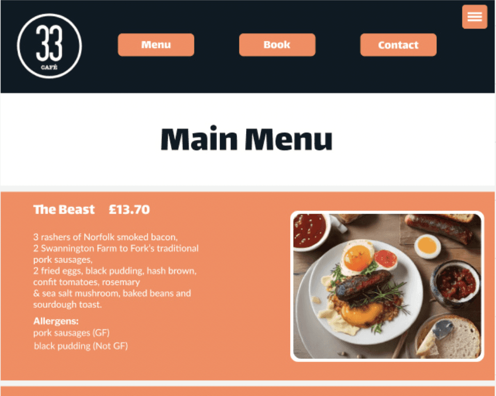
Allergen information: Ensuring that allergen details are clearly displayed for each meal.
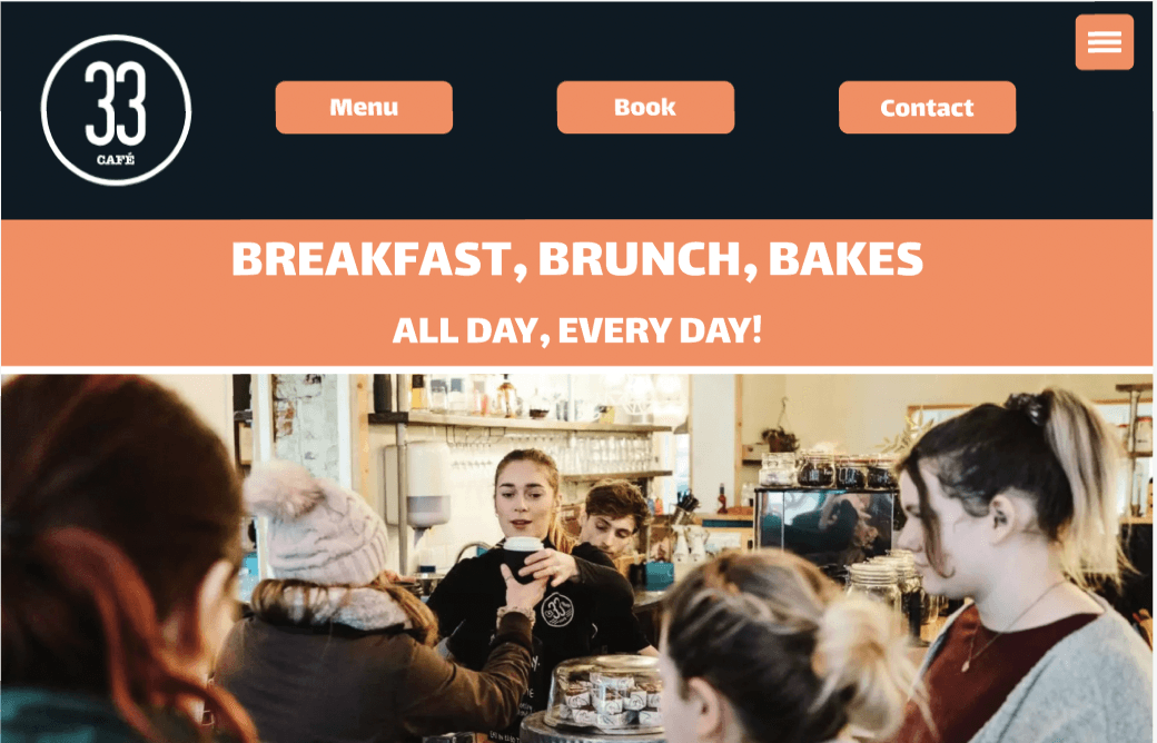
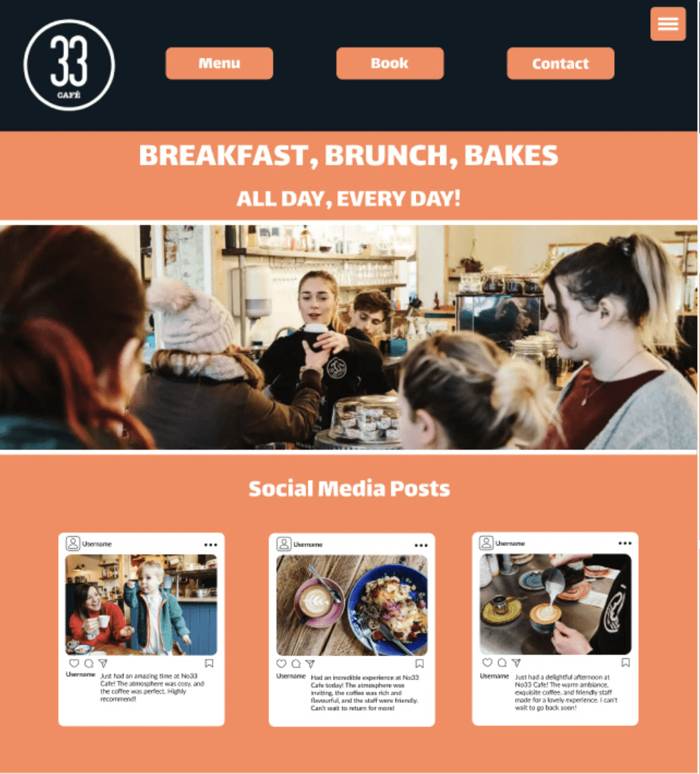
Additionally, I noticed that some pages on the site were provided by third parties, and these had a different visual style, which could confuse users. To maintain consistency, I decided to incorporate the website's existing colour palette (orange, white, and navy) throughout the entire site, as this combination works well and gives the site a cohesive and unified look.

Result
Overall, I met the brief by redesigning the homepage and menu, making sure the design was clear, easy to navigate, and visually aligned with No33 Cafe's identity.